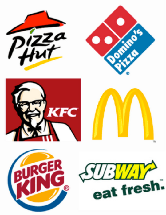
Notice something in common? That’s right, the color scheme. Most fast food chains contain the colors red, yellow, and sometimes orange in the color of their logo. Why you ask? These colors, according to color theory, subconsciously trigger hunger and/or induce excitement. They often cause consumers to spend more money and leave quickly, which is just what these types of restaurants want you to do. Study shows that you also eat more in a room surrounded by warm colors opposed to cooler colors. Notice how weight loss ads and programs use cooler colors like blues, greens, and browns? Restaurants on the more healthy side, like Subway, also incorporate these cooler colors. Cooler colors are actually known to suppress appetite. Some weight loss programs even encourage users to eat from blue plates or putting a blue light inside the fridge. Beiges and Browns are known to be more luxurious. Think about it nice sit down dinners usually have wooden floors. Many of the foods we eat are also in this color group. Those include: breads, pastas, meat, beans, etc.
So next time you’re out I encourage you to take a look around at all the different colors. Some of the fast food chains and weight loss advertisements pictured have obviously figured out what colors work best in their line of business. Colors really do play a role in our everyday lives. Pretty cool, huh? I thought so!

